Searching for interesting online datasets, one of the first you’ll encounter is Death Row data from the Texas Department of Criminal Justice. There are several datasets listed on the Death Row Information page including Executed Offenders.
To convert this information into an infographic, the first step is converting the HTML table to a format that’s easy to load and parse. Toward this end I used the Ruby gem, Wombat, to scrape the Executed Offenders table and convert it to JSON.
The following code builds a hash from the Executed Offenders table:
table = Wombat.crawl do
  base_url "http://www.tdcj.state.tx.us"
  path "/death_row/dr_executed_offenders.html"

  headline xpath: "//h1"

  people 'xpath=//table/tbody/tr', :iterator do
    execution "xpath=./td[1]"
    first_name "xpath=./td[5]"
    last_name "xpath=./td[4]"
    race "xpath=./td[9]"
    age "xpath=./td[7]"
    date "xpath=./td[8]"
    county "xpath=./td[10]"
    statement "xpath=./td[3]/a/@href"
  end
end
The above code iterates through all of the table rows (tr) and grabs data from the data cells we’re interested in.
We could stop with the above code in terms of parsing, but at the time I generated this script I was also thinking about analyzing final statements. Since last statements are stored on separate pages referenced from the Executed Offenders table, this next code section scrapes each last statement and replaces the statement link from the table with the actual statement.
data = {}
table['people'].each do |x|
  last_words = Wombat.crawl do
    base_url "http://www.tdcj.state.tx.us"
    path "/death_row/#{x['statement']}"
    statement xpath: "//p[text()='Last Statement:']/following-sibling::p"
  end
  x['statement'] = last_words['statement']
  x['gender'] = 'male'
  unless x['execution'].nil?
    data[x['execution']] = x
    data[x['execution']].delete('execution')
  end
end
At the tail end of the above code block is a bit of cleanup to remove duplicate data and to slightly shrink the hash.
The next code block writes the hash to disk as a JSON array:
File.open('dr.json', 'w') do |f|
  f.puts data.to_json
end
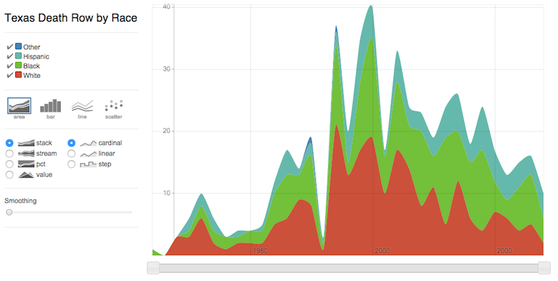
Now that we have the data in an easily digestible format, the next step is to generate a display. I used the Rickshaw JavaScript toolkit - a D3.js wrapper - to convert the data into an infographic.
I repurposed much of the Rickshaw Interactive Real-Time Data example. The main crux of this project was parsing the JSON data into the correct format for use with Rickshaw.
I used CoffeeScript to define and compile JS assets. A limitation of Rickshaw is an inability to cope with unset values (I initially expected these might be treated as zeros). With this in mind, the first step was to populate every possible x-axis value with zeros to avoid errors.
Below are three functions that initialize all of the data points with zeros:
timeAxis = ->
  time = {}
  for year in [1982..2014]
    time[year] = 0
  time

races = ->
  ['White', 'Black', 'Hispanic', 'Other']

preload = ->
  time = {}
  for t in races()
    time[t] = timeAxis()
  time
The last steps are to add the real data, and to build up the chart components. I read in the JSON file with jQuery ($.getJSON file, (data) ->), and ran the data through a couple of quick conversions before building the chart:
pop = (data) ->
  struct = preload()
  for k, v of data
    yr = /\d{4}$/.exec v['date']
    struct[v['race']][yr[0]]++
  struct

tally = (arg) ->
  count = {}
  for t in races()
    count[t] = []
  for a, b of pop
    for r, s of b
      z = new Date(r)
      m = z.getTime()/1000
      h = { x: m, y: s }
      count[a].push h
  count
I’ll spare you the chart code here since it’s fairly lengthy and well documented. But the full code for this project is available here. And the final product can be viewed here. Note that the default chart zoom shows the year ‘2000’ twice. I haven’t looked into this much yet, but the correct year (2010) appears on the second ‘2000’ value on zooming in.
Overall, I found Rickshaw to be a fun library with an excellent API. It does have limitations, but is a good choice for representing time series data. If you need more options for chart type, see NVD3.js or straight D3.js.